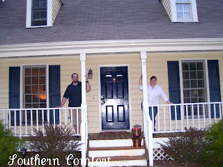
Welcome to Southern Comfort!

Hi, I'm Elizabeth and I invite you to grab a glass of sweet tea and join me as I (along with my husband, John) renovate our love nest. We're both born and raised in the south and love to share with you some of our favorite recipes, stories and our life. We hope you'll come back often!

Wednesday, April 28, 2010

What I'm loving right now

When Spring rolls around each year I feel inspired. I want to throw open all the windows in the house, air it out and get the wonderful smells of blooming flowers and freshly mowed grass flowing through each nook and cranny. This was such a long and cooooold winter here in NC and it has made me extra thankful this year of our gorgeous Spring. With all that in mind, here are some pictures of things I am adoring right now (and some things I'd rather be doing if I had the time).

I love going to the Farmers' Market. I love purchasing gorgeous flowers and fresh produce from local farmers. I was grown up always eating the freshest and most delicious fruits and veggies. This time of year always makes me crave going back to the market just to browse and take in the sweet smells.  There is nothing like the smell of the farmers' market; sweet, earthy and warm all at the same time. To me it's heaven. I'm sure my Grandaddy would say the same.


I could easily cozy up and read a book here for a few hours.

 Strawberry pickin'. I love getting my hands in the earth and picking out the sweetest, juciest, sun drenched strawberries. I love picking them right off the plant and popping them in my mouth. Warm, sandy, rich and flavorful. Oh. My. It's perfection. Normally I'll drag John along with me (this really isn't his scene) but he doesn't seem to complain too much once the strawberry pie comes around that evening. So he comes along with me and helps pick them out. I think he enjoys basking in the sun while we pick. He'd never admit it though. :)


The smell of fresh herbs. As the sun comes out and warms up these botanicals you can smell them across the yard, even more when the breeze gets hold of them. I love sitting out on our deck, in the sun smelling the earth. There really is nothing like it.
These are a few of my favorite things about Spring. What about you?

Monday, April 26, 2010

Lord, Give me Advil

If you've been following long, you know John and I just bought a house full of laminate flooring. Well, this weekend was THE weekend to install. Let me be the very first to say, don't be fooled. It is JUST as difficult to install as hardwoods. It creates the same about of sawdust, the same amount of headache and the same amount of time on the floor and the same amount of very large tools. Just with a cheaper price tag.

If I seem to be away for the next few days please don't despair, I am still here. I am simply trying to get my house put back together. Clean up the layer of sawdust that has landed on every. single. thing. in the house, getting all the furniture re-arranged to the perfect place and making sure all our appliances aren't going to leak, spray, or electricute after moving them all over the house. Not to mention cut the poor Maggie's toenails so she doesn't slip and slide everywhere. Poor dear. She's had it rough for the past 2 days.

Stay tuned though, I'll give you the full run-down as soon as I get a shower. Including some awesome tips for you for when you (yes, you. And yes, you can do it!) decide to do you're own DIY project.

Thursday, April 22, 2010

How We Met Our House

Today I'm linking up to AnNicole over at Our Suburban Cottage for her How I  Met My House party. So go on, check out all our favorite readers and their stories about how they came to fall in love with their homes.


As for us, our home was a very large dream. It was December 2007 and John had just graduated college (I graduated a year before and was living with my parents). We needed a place to live. We had very little money and wanted a place of our own. Luck would have it that we could afford an apartment really close to both our jobs and my parents. We loved our apartment. 1150sq. ft. 2 bed, 2 bath, lakeside views. It was perfect for us.. at least, for the moment.  After living there for 6 weeks, we quickly realized it was nothing more than a glorified dorm. Loud neighbors upstairs, loud music, no yard to play (or garden in) and still living by someone else's rules. We knew we wanted a place to call ours. So we stuck to our guns, and saved our money. Two years later, we began the hunt. John had just proposed and we decided to buy a house the summer before our wedding (for anyone out there who just got engaged, DO NOT DO THIS! Wait until after the wedding. You'll thank yourself later!)


Knowing we wanted a home, we did the logical thing and started looking on our own. When we got more serious and started looking at particular nieghborhoods we contacted a realtor-friend. She did not help us one tiny bit. She took us to neighborhoods we weren't comfortable in (but took us just because the price was right) and just about got us shot on more than one occasion. We had to fire her. No hard feelings. Then Claudette entered our life. She was able to pin-point exactly what we wanted, didn't want and showed us houses that were perfect for us. After only viewing 3 houses, by that evening an offer was made. We closed on our house on July 16th 2009. The happiest day of my life (thus far.. until marrying the man of my dreams!).


And thus, Southern Comfort was born. It was through this time of home buying that made us realize how special it was to own our home. We are so fortunate to open the back door to let Maggie in and out instead of having to drag, her at 3am, on a leash, down a flight of stairs in the cold, trying to avoid goose poop just because she heard a noise. It truely is the little things of owning a home that make it so wonderful.

Tuesday, April 20, 2010

Teresa's New Guest Bath: Design Accomplished

Teresa is a wonderful friend who I have the pleasure of working with. After getting to know her and finding out she and her husband Seth are in dire need of a bathroom makeover, she gave me the pleasure of creating an updated bathroom for her home. This particular bathroom is shared by her two children; a boy and a girl. But on top of that, it is also the guest bathroom when they come to stay. I'll describe the room breakdown later, but let's see what wer're working with first.


Teresa tells me she wants a space that is kid friendly and guest worthy. We need a space her kids can grow with and still maintain a level of adult sophistication. Everything can go, but because their lives are so hectic, there isn't much room either in the budget or the schedule for a full remodel. Teresa especially hates all the gold fixtures which really date the space.  So here is my plan for Teresa and Seth's new bath.
Here's the room breakdown for you:

1. New paint! Get rid of the wallpaper ASAP. :) The color I chose was Smokey by Benjamin Moore. It has blues and a hint of green to make this room feel relaxed and playful at the same time.

2. New Floors. I chose 13x13 inch tiles from Lowes. I chose larger tiles a) they're faster to install, they will make the space feel larger and it's the perfect flooring for roudy kiddos after bathtime. Easy clean-up and they hold up over time. And, at only .69 cents a tile, they fit the budget too. The color of the tile is Grecciano Beige from Lowes. The pefect color of sand to accent our blue walls (and hides dirt too!)

3. Lets talk fixtures. I chose chrome for this space. Yes, I know that brushed nickel is all the rage right now and yes, it is beautiful. But keeping in mind that kids will be using this space, brushed nickel shows every water splatter, soap scum and every little bit of spittle from toothbrushing (yes, it happens), and just isn't very practical for a already over-worked mom. We need to keep it easy people! So, Chrome it is! Easy clean-up, low maintenance, and will help tie together the spa/beach-y feel we have going on.

4. For the bathtub I chose a shower curtain. Teresa hates all the gold, and by the time this room gets a makeover, all of it's roman inspired decor will be history. We'll take out the glass surround (which holds all kinds of mold and germies over time) and replace it with a simple shower curtain. The one I chose is from Overstock.com. The stripes will help bring the eye up, making the room appear taller and lighter. The blues, creamy whites, and little bit of yellow will help bring the look of the bath together. While we're in the tub, it will get a simple make-over too. New chrome fixtures will be a new feature for bathtime too.

5. While we are talking about the bath tub, let's talk about mats. I like using white bathmats. You can see when they need washing and they give you a sense of cleanliness. White is classic and will always look good. Since this space will also be used for guests, we wanted to keep the look chic and updated. So a large knapp with big loops will do the trick. Just like this one I found at TJMaxx. At only $14.99 it will hold up for years of little wet feet.

6. Towels. The ones I chose are a pattern of fun coral and sea shapes. They are pricier from Pottery Barn, but  they have the same sand, creams and blues of the bathroom so they'll be perfect. I recommend on keeping them out for looks, but letting the kiddo's use a similar, solid colored towel for everyday use, like the blue ones I found at Bed Bath and Beyond. This will keep the fun ones from being destroyed and they'll be the accent to the bathroom and for guests.

7. Let's talk about the vanity. Since this isn't a remodel, simply a cosmetic update, we aren't replacing the vanity. We'll replace the gold fixtures like I mentioned before with the chrome ones you see above. We'll also replace the HUGE mirror with two simpler ones over each sink. The contrast of the dark brown will give the room a little more demention and texture. Since their light fixture is in the middle of the vanity, we'll keep it there and just replace it with  beaufitul matching sconces that will accent and give the vanity plenty of light. Replacing the knobs will instantly give this tired vanity and instant face-lift.

8. Artwork. I love the look of the canvas artwork shown above. With the playful coral on the white background it is very suitable for kids, but also relaxing and calm enough for adults to enjoy too. I'd place them over the toilet in either sets of two's or three's, depending on the size. Another altertative is to make homemade artwork. Going to Michaels (or any craft store) and buying the blank canvas, and matching paint colors (cool blues, creams, soothing yellow) and letting the kids do some finger painting for their space. If you're feeling ambitious you could put your children's monogram on top of their artwork (or in the corner). This is a fool proof method (just make sure you only give them pre-approved paint)  of cheap art that your kids can get into as well.

So what do you think? Anything I left out? What suggestions do you have? Do you have a room in your house you'd like me to "re-do" for you? I'd love to help!

Monday, April 19, 2010

Bedroom Update

Remember back when I showed you our bedroom? After looking at those pictures I immediately thought, OH. MY. GOSH. Elizabeth! What have you done?!!? You've done one of the cardinal no.no's in design! Eeek! I knew I had to change it. But I have just not had the time until this week. If you don't know what I'm talking about.. take a look at my curtains.


See how you can see the moulding on top? Eeeek! I have not done my bedroom ANY favors. It looks messy and makes my windows look small. Here's the problem: The curtain panels are (I believe) 84 long. I needed 96" to reach from the curtain rod to the floor. So I went ahead and lowered the curtain rod for the panels to reach the floor. Which sounds good in theory, until you look at the top of the panels. With the curtains hanging from the rings it gave me a little extra wiggle room for our curtains to pool on the floor. However, with that extra wiggle room it makes the curtains look messy and incomplete. Dang it! Ok, I need to lengthen the curtains.. but how...?

Enter Mill Factory Outlet. If you live in the RDU area, you probably already know about this fantastic place. I ran in there the other week with nothing really on my mind to purchase. This will always get me in trouble. Ask my husband.
I was rummaging through the designer fabric clearance table (can you believe they have such a thing!?! designer fabric on my goodwill budget! HELLO!) and came across this beauty:

4 yards and $15 later she was mine. All mine. I knew exactly what I was going to do with it. Since it has some weight behind it, I can add a panel of it above my curtains to extend the length. The colors are perfect and will add a little extra pizzaz. Perfect. And I had a little left over to make a pillow cover for the body pillow. Woot woot!

After making my new curtains, I had the hubs grab the drill and the step-ladder and we moved the curtain rod ABOVE the moulding several inches. It makes our ceiling and our windows appear larger and taller. An instant plus. My nice looooong curtain panels help bring the eye up. Gorgeous.


Another area that was bothering me was our shelves. Remember back in January when I found these shelves and decorated them.

 Well, they looked ok. But it wasn't what I was looking for. The shelves were fine, but It looked like I tried to make them look good, but it didn't work. Something was missing. So I scoured some old Pottery Barn catalogs (yes, I keep mine) for inspiration and figured out a plan.
The candlesticks had. to. go. They were just a mess up there. I spray painted the E black to match the room, already it's looking better. Then I found a frame from our wedding that I placed our wedding invitation in. After a little re-arranging it's perfect. And for $0 it fit the budget too. :)


I learned recently that for a happy marriage, your bedroom should be your sanctuary. It should feel cozy, relaxing and have nothing that shows your "life"  (kids, bills, toys, computer, etc). It should be a place that re-unites you as a couple. With this in mind, I decided to only put accessories in there that relate to us. What better than pictures and items from our wedding and us as a couple. I now love coming into our bedroom. We try and keep it clutter free (more me than him, the clothes keep multiplying on the floor!) but we love being able to climb into bed at night and be surrounded by our history together.

Remember the wall that looked blank?


Yeah, this one. I knew I wanted to put something on that wall, but I just didn't know what. Until it hit me. My wedding portrait. It was on the wall at the end of our staircase, but it never really "Fit" that space. So I moved it. Now, it gets all the attention it deserves, and fills the space perfectly (please disregard the boxes of flooring. We are waiting patiently to install them).

I have one last thing to put in this space (hint, above the bed) but it can't happen right now. We are desperately trying to get the house ready and prepped for the new floors. So stay tuned!

I linked this post to Kimba's DIY Day so click away and
Browse through lots of other projects to get your decorating fix!

Tuesday, April 13, 2010

Consumer Reports Puts 'Green' Paints to the Test

With the ever-growing concern of the Earth and companies wanthing the trendy chic label of "going green" on their products, many home improvment companies are doing their best to downsize their carbon footprint. This is fabulous news for all of us, and Mother Nature too. For years companies have provided a safer, more environmentally friendly paint for our homes, but without the market, they haven't been able to leap into stores. Until now. To help us along with this new trend in home improvement, Consumer Reports is here to help us discern which products will help us all get the look, without the harm on our local eco systems.


Environmentally-friendly paints are getting better performance ratings from Consumer Reports.
These so-called "green" paints have lower levels of VOCs, volatile organic compounds that contribute to respiratory problems and air pollution.
"When we tested low VOC paints in the past, we found they didn't do very good, particularly at covering the darker colors,” said Rico De Paz, with Consumer Reports.
Consumer Reports' latest tests of more than 50 paints still found problems with some brands claiming zero VOCs.
For example – the Freshaire Choice from Home Depot. "You can see all the stripes with one coat. And even with two coats, you can see a lot of the stripes,” De Paz said.
However, some paints, such as Behr Premium Plus Ultra from Home Depot, performed well, covering better with one coat than some do with two.
"This is one coat of paint and you can see it did a great job of hiding,” De Paz said while testing Behr.
Behr has only 50 grams of VOCs per liter, which meets the strictest regulations in the country. It earned top ratings in all three finishes – flat, satin and semi gloss.
But that paint did not perform well in the fading test, so it may not be the best choice for a sunny room.
"This is the original color. And you can see, when we exposed it to a lot of light, it faded quite a bit,” De Paz said.
A better choice for a bright room is Valspar Signature Colors, sold at Lowe's. While it didn't perform as high overall, it did well in the fade test and contains just 50 grams of VOCs
Consumer Reports says one thing to keep in mind is that the amount of VOCs in paint refers to un-tinted paint. Adding tints increases the levels of VOCs.
As for picking the right gloss level, flat paint hides imperfections but tends to stain more easily. It is best for low-traffic areas.
Semi-gloss paints are easy to clean but tend to dull in the process. Use them for trim, windows and doors.
Satin and egg shell paints combine the best of both and are the top choice for most areas.

Article Source

I hope you all found some of this interresting, and even helpful. Stick around, later this week I'll fill you in on more of Kitchen Diva and Ranger Dad's bathroom redo!  Squeeeel!

Wednesday, April 7, 2010

Kitchen Diva Mom and Ranger Dad's Bathroom Remodel: Part 2


A couple of weeks ago I shared with you the demolition of the Purser master coffin I mean, bathroom. You can check that out here. Since that post, things have seriously taken on a new vibe. The construction vibe that is. If you've ever done a remodel in your home you know that most of the time that particular room (as well as others) claim the tools, gadgets, supplies etc. This project is no exception. See?

Vanity: check
Bathroom door: check
Tile: check
Grout: check
Level: check
Dustpan: check
Broom: check
Putty Knife: check
Bucket full of other tools: check
Toilet brush (even though there's no toilet at this point): check
Wet Vac: check


I'm sure there's more. It's just in the unlabeled boxes or tucked out of sight.

But at least the tile is here and ready to go. Here is a peek at the accent tile to go around the shower.
It will be gorgeous accented against the travertine tile of the floor and shower. Especially after it's sealed. I literally squealed when I saw what they had picked out. To. Die. For. It's the jewelry of the bathroom.


So last time I left you, I talked about all that hideous tile and cement that incased this already too small space. Since then,  Ranger Dad and Joey (the tile guy) have insulated the entire bathroom. Can I get a halaluiah?!? No more cold winter morning showers! They've also begun putting up all the cement backerboard on the walls (that's the purple stuff you see). You can see a peek of the bottom of the shower if you look closely in this picture.
This is where the vanity used to be (and will go back after the tile is in). Thank God they got rid of those ugly sconces though. They were rough lookin' and about 30 years overdue for a facelift.
Joey did an amazing job of laying the floor tile. They those 18x18 travertine tiles. Aren't they B-E-A-U-tiful? (name that movie!) I could die. Joey chose to lay them on the diagonal to open up the room a little more. A small thing like that can really change the look of how large (or small) a room can seem.
See? Looks bigger huh?
And if you remember, oh heck, I'll just show you. See how using a little muscle and tearing out the header above the shower and opening up the door way really makes all the difference. Makes the room look larger, taller and the shower not seem like a coffin. Simple fix.

before:
(sorry for the absolutely horrible pic. again a cell photo)

after:


Since Mom and Ranger Dad didn't have the space to make the bathroom larger (boo) they are using what knowledge, know-how, and resources they have to give this space a much more updated look. Without busting the bank. Just so you'll know what's coming up.

For the shower:

  • Travertine tile surround with glass accents

  • updated Moen fixtures in brushed nickel

  • shower light (so you can actually see what you're washing!)
For the Floor:

  • New Travertine tiles (as you can see)

  • New white toilet (hasn't been picked out yet)

For the Walls:

  • White Beadboard Wainscotting 44" high (about shoulder height)

  • New wall color from the beadboard to the ceiling (still to be picked out, I think they should go with the bedroom color to bring the whole master bed/bath together.. What do you think?)

  • New matching brushed nickel sconces

For the Vanity:

  • They are recycling the current vanity and reusing it for the space. Which is fine because it is still in perfect shape.

  • New granite countertop with sunken sink

  • New Moen fixtures to match the shower in brushed nickel
I can't wait until it's fnished and I can share the results with you! For now, Ranger Dad is still working on the wainscotting.

Monday, April 5, 2010

Happy Easter from our house to yours

Sorry for the delayed Easter post. One day late isn't too bad right? I didn't think so. We had a fantastic Saturday spent with friends and family at our house. We combined Easter and Spring birthdays to have one fun filled day of eating and gathering with family and friends. Just so you feel included, here's how it went down.

Greeted by Yours Truely and of course my good lookin' hubs, just in time for some good eats.

{sorry for the bad picture, we need a new camera}
Since the weather was so pretty on Saturday I wanted to eat and spend some time outdoors. And we had the perfect newly stained deck, we had to enjoy it!
I spent several minutes getting the table set. Seriously, it took me no time. I spent waaay more time trying to get up all the pet hair off the floor than setting the table. For. Real.  The tablecloth was given to us as a wedding gift. And the table runner is just some folded fabric I got on clearance a few years ago that I have no idea what to do with now, but love it so much. It fits perfectly here.
A beautiful bouquet from Trader Joe's makes the pink and green theme come together. Very Spring-y I think. And the price was right at only $3! Clearance. Love TJ's!

We sat outside all afternoon and most of the evening enjoying the birds singing, the cool breeze and each other's company. The food was fabulous. Honey-baked ham, deviled eggs, chocolate covered strawberries (thanks Emily!), fresh asparagus, fruit salad, rolls and plenty of lemon pie. Oh, and these:


Aren't the cute? Vanilla-Lemon cupcakes. Because how do you celebrate birthdays without cake?!?
I hope you all had a wonderful Easter with your loved ones.

Thursday, April 1, 2010

Easter Inspiration

As I was thumbing clicking through my blog favorites this morning I came across one of my favorite decorators of all time. Eddie Ross. He just updated his blog with the most gorgeous Easter tablescape. Love.
If you remember, it was Eddie's post at Christmas that inspired me to make THIS wreath. I look forward to using it for many more years to come, and I would love to make an Easter one too. Pinks, greens, creams yummmo. hmm. But I digress.


Anyways,
Here is the tablescape that Eddie was asked to decorate at Hall's in Kansas City for Easter.


With Eddie's creative genious and wonderful partner Jaithan, he was able to take the table above, all these eggs and turn them into the most gorgeous table. Just look at how many eggs he blew! 14 dozen.


Aren't they pretty?! But then again, I looooove glitter.


So here's the table. Finished.


You can get all the details and how-to's from his blog here.

I can see this table decorated in shades of yellows and creams or pale pink and green too. Oh the possibilities! I hope y'all enjoyed looking at this as much as I did. True inspiration.
voyeur porn porn movies sex videos hd porno video